JacArth Photography Website
Problem
JacArth Photography is a small business who booked clients by word of mouth. The client needs a professional website to display his offerings for his customers to seamlessly book his services.
Roles and responsibilities
I was responsible for all aspects of this project including, but not limited to, ideation, discovery, research, design, testing, and prototyping. I worked closely with the client and some of his customers throughout the design process.
Audience
The primary audience for this project are the client and his customers. The customers can be categorized into current customers and aspirational customers whom the client wishes to attract.
Solution
This is a website design for which will make it easier for customers of JacArth Photography to book his services online.
Research and Discovery
Research Methods
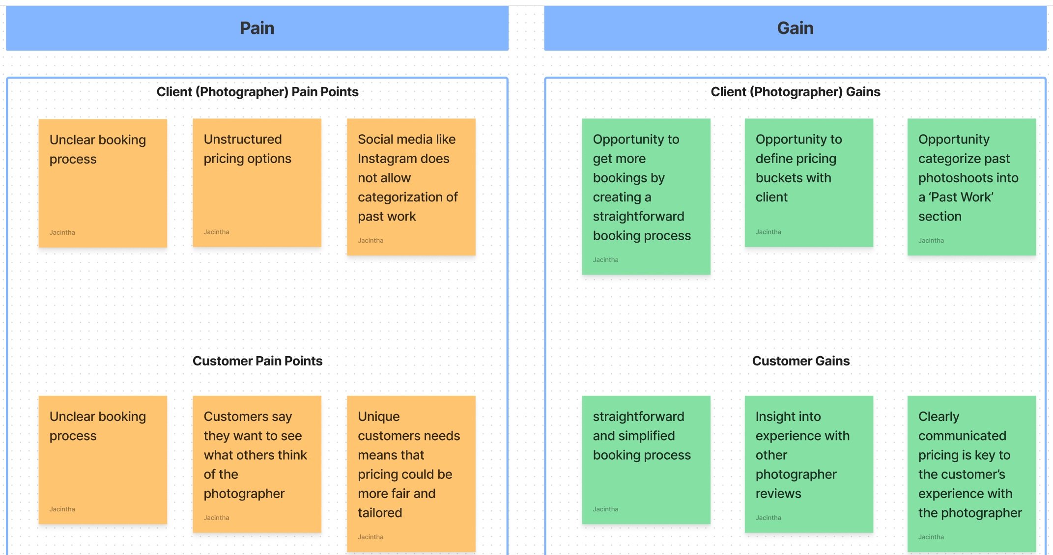
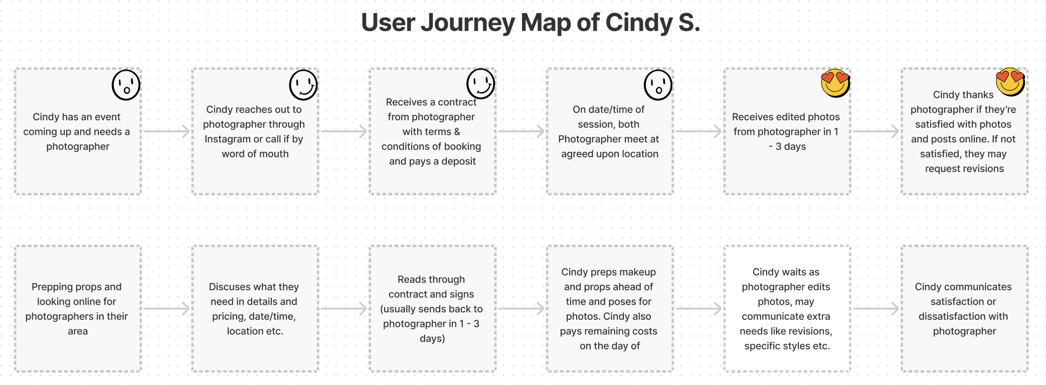
The primary research methods used for this project was Qualitative Interviewing and Observation. The interviews were comprehensive discussions with the client and customers on separate occasions. I also observed the client’s booking process live during his interaction with a customer and spoke to the customer to create a user journey map.
Insights from Interviews and Observation
Client Interviews
The primary research methods used for this project was Qualitative Interviewing and observation. The interviews were comprehensive discussions with the client and customers on separate occasions. The client interview focused on his current customer reservation, pricing, and marketing.
Insights:
Booking clients is most important to his business
Biggest pain point is not booking clients due to unclear booking process
Social media is important to him so he would like to link his website
The best features he would love to have would be an About Me page, FAQ page, reviews, pricing information, past work
Customer Interviews
I interviewed two of JacArth's current customers. Customer interviews were focused on their experience with JacArth Photography as well as their experience with other photographers.
Insights:
Past booking experiences felt old fashioned and outdated
They prefer to see a website with the photographer’s past work
They expect the booking process to take less than 30 minutes
They would like the photographer to have more creative input/offerings in the process
User Stories
The interviews and observations resulted in four user stories which mainly focus on the customer’s experience. I included a user story for the client to make further capture his creativity in the final product.
As a potential customer, I want one place to seamlessly reserve the photographer’s services.
As a potential customer, I want to see the photographer’s previous work so I can decide if he is the right fit.
As a potential customer, I want to know the pricing for a photoshoot to help me decide what the right service is for me.
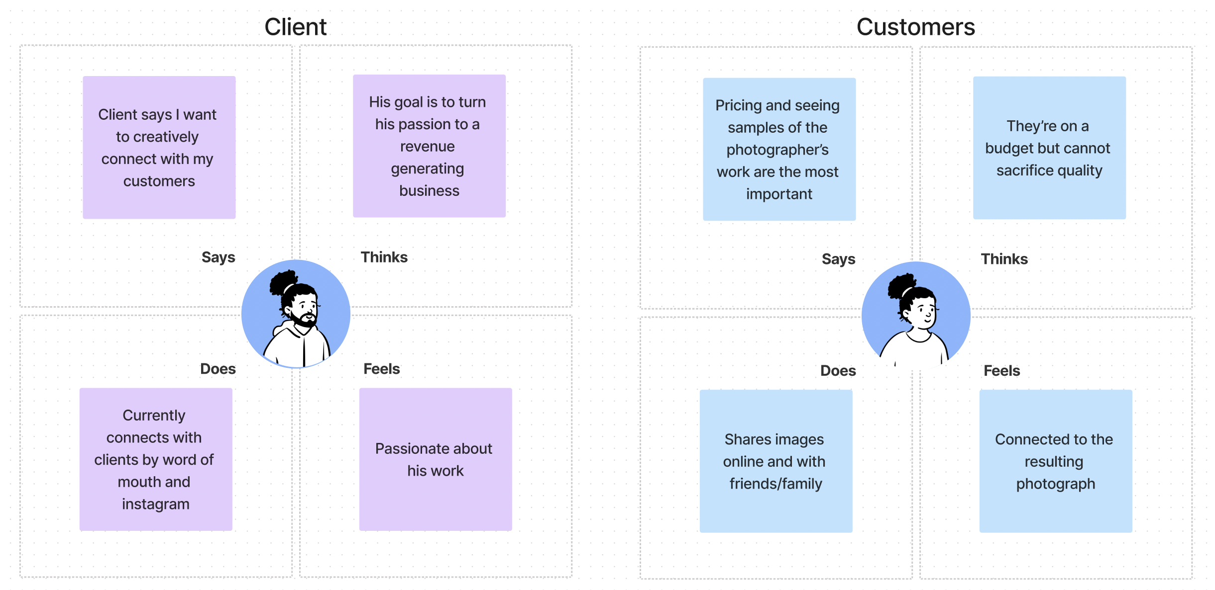
As a photographer, I want to creatively connect with my customers whether on social media or on my website.
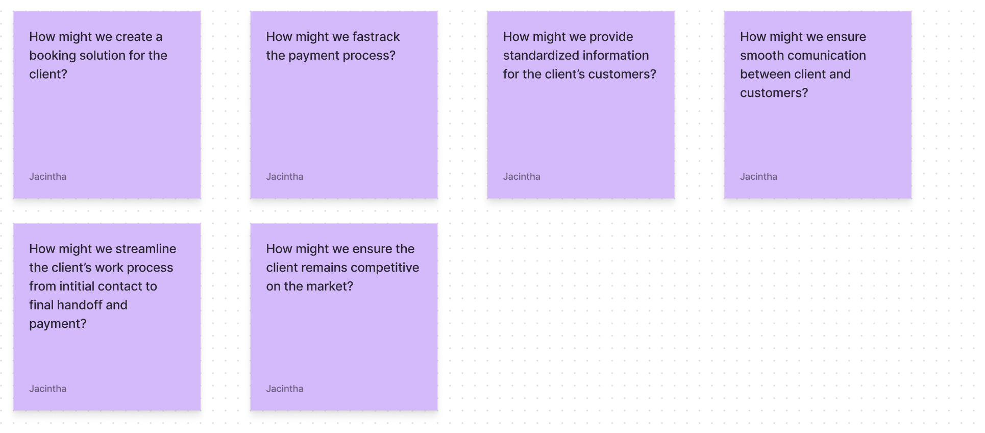
Asking ‘How might we’ questions to define the problem and better inform the personas.
Personas
From the research process and user stories, I developed two personas, Cindy S. and Sharon A. The first persona, Cindy represents JacArth’s current customer base. She is young, creative, and books photography services on a budget. The second persona, Cindy represent’s the client’s aspirational customer whom he hopes to attract with a professional website. She is more mature and put together, and she is not as budget constrained as Cindy.
Meet Cindy S.
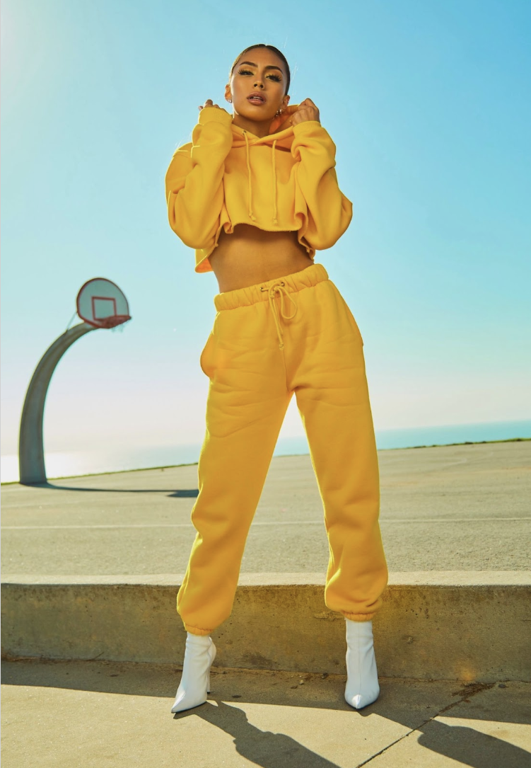
“I always go big on my birthday! I need creative photos to post on social media. If I can get amazing photos on a budget, that would make my day!”
Demographics
18 - 25 year old
Female
Behaviors
Avid social media user
Creative and confident
Aspiring model
Needs & Goals
Goal to build social media following
Needs reliable photography service on a budget
Has lots of creative ideas and needs help executing them

Meet Sharon A.
“I’m planning my dream wedding and need a photographer for the event. I need pre, post, and event photo coverage. My partner and I are willing to pay extra for the best service”
Demographics
25 - 45 year old
Female
Behaviors
Uses apps like Pinterest & Instagram
Modern and minimalistic ideas of decor/design
Has a wedding Pinterest board
Needs & Goals
Wants to enjoy wedding day with minimal hassle
Wants an aesthetically pleasing wedding
Has a moderate budget for the wedding
Design & Delivery
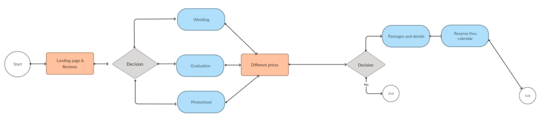
Initial User Flow
From the research and personas created, the next part of the process was beginning to lay down a user flow. For the initial idea of the flow, Cindy and Sharon would start the experience on the landing page which would include package options offered by JacArth. They would select a package and then proceed to pricing and details. After selecting a price, they would go through a reservation process by selecting a date and time. After the process, they can exit the site or return to the landing page.
Sketching and Wireframing
I began the delivery process with multiple sketches iterating on the same idea before going on to wireframes. The initial wireframes primarily focused on a photo package first solution as the landing page. The second most important feature for the website was also developed here. This was the pricing options I worked with the client to develop.
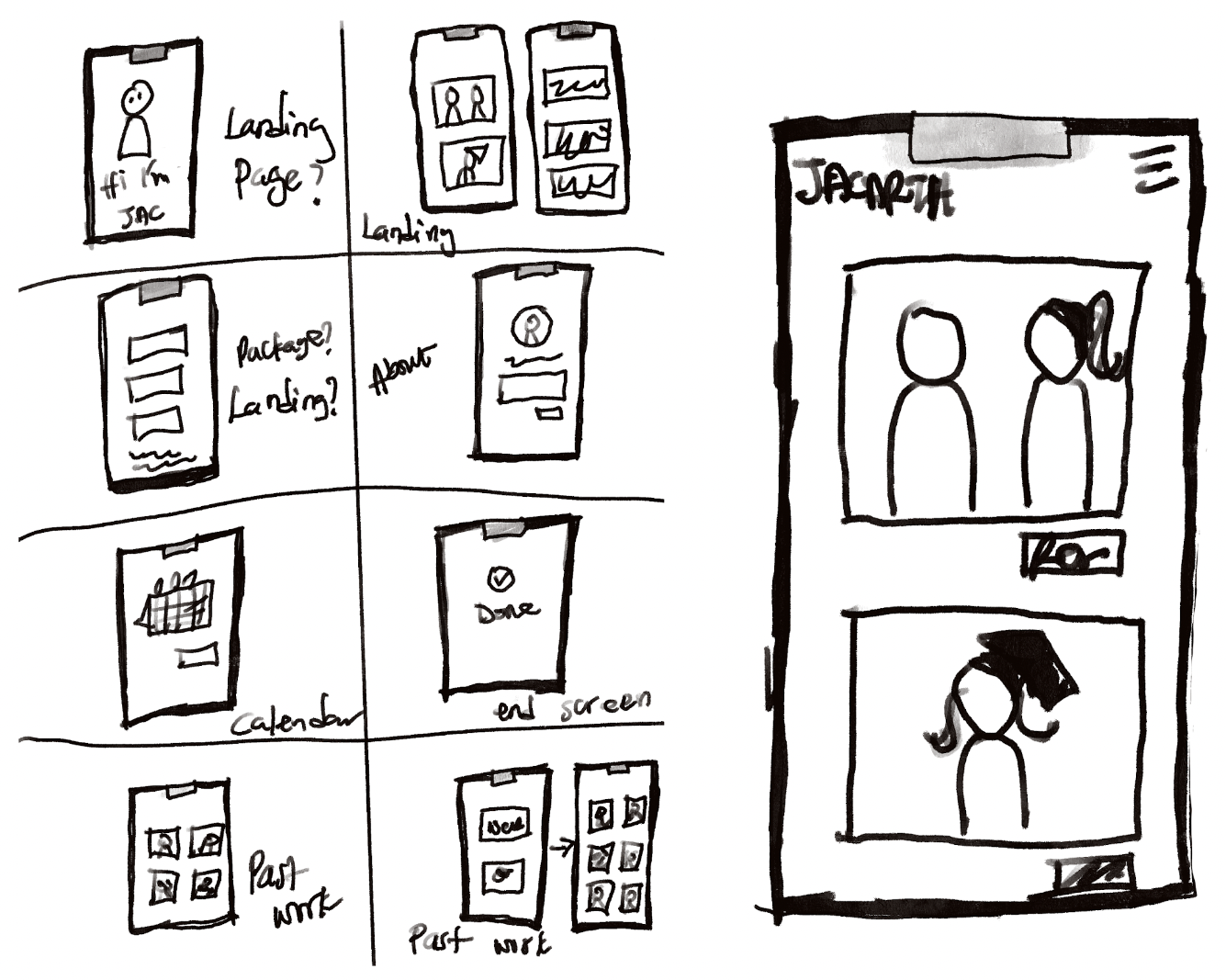
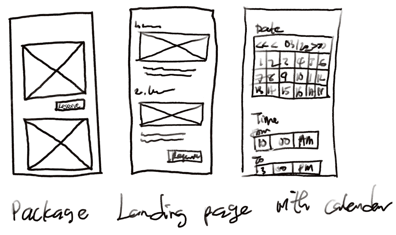
Hand-drawn wireframes and sketches
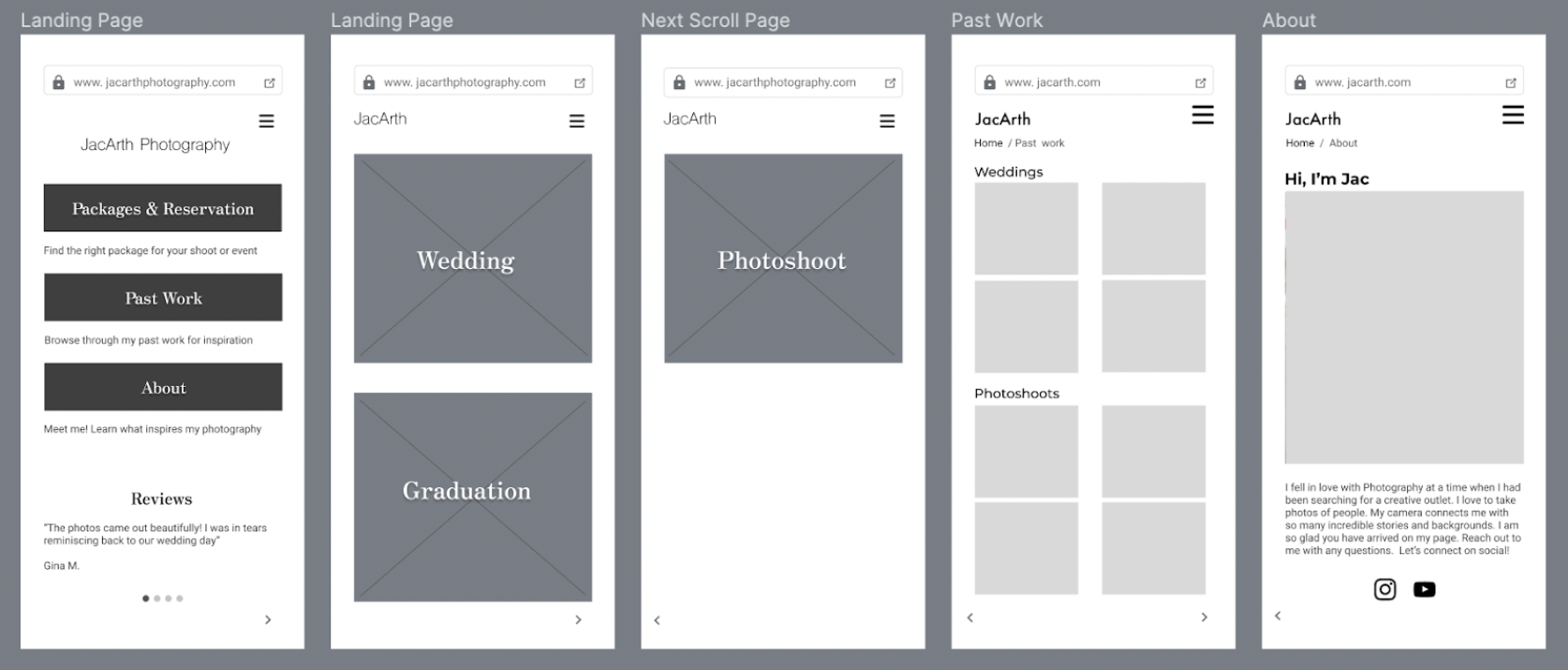
Initial Digital Wireframes
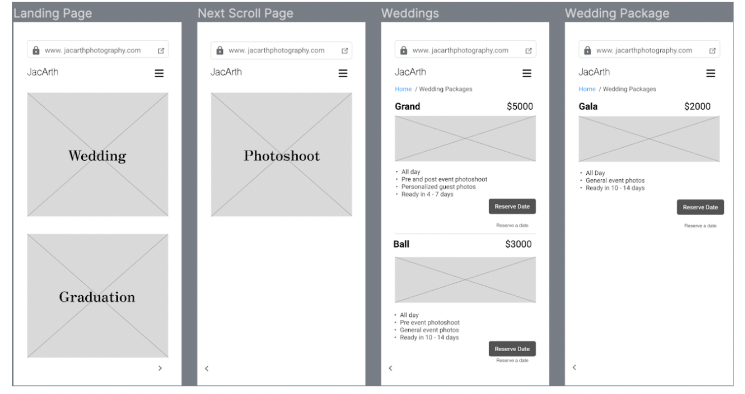
Initial Hi-Fi Prototype
The initial prototype followed the wireframes and developed on the package first solution. I added some stock photos at this stage and did not focus too much on other considerations such as branding or style. At this stage, the basic structure for the prototype was taking shape and it was time for usability testing with the client and his customers.
Usability Testing
After developing the first iteration, I tested the prototype with the client and his customers. The first pass was well received with helpful feedback from both client and customers.
Task: Reserve a session with JacArth Photography.
Two major insights were drawn from testing and these informed the next iteration of the prototype.
What users liked:
The design is easy to navigate
The process of reserving a session with the photographer is easy to get to
What could be improved:
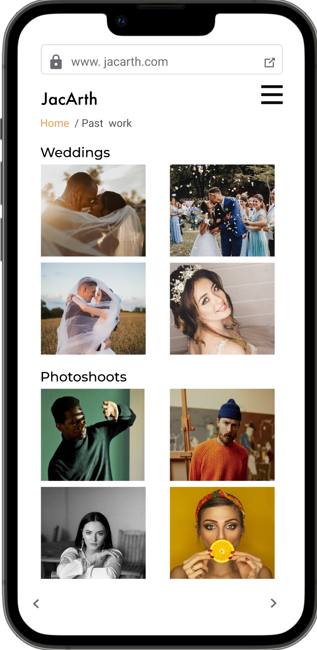
Customers felt that they needed a separate page(s) to see the photographer’s past work
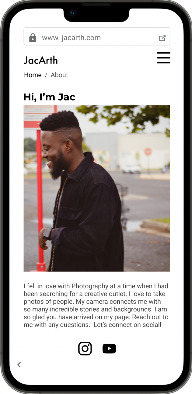
Client felt that his personality could also be represented more. He felt “missing” throughout the design.
Updated user flow based on usability testing insights
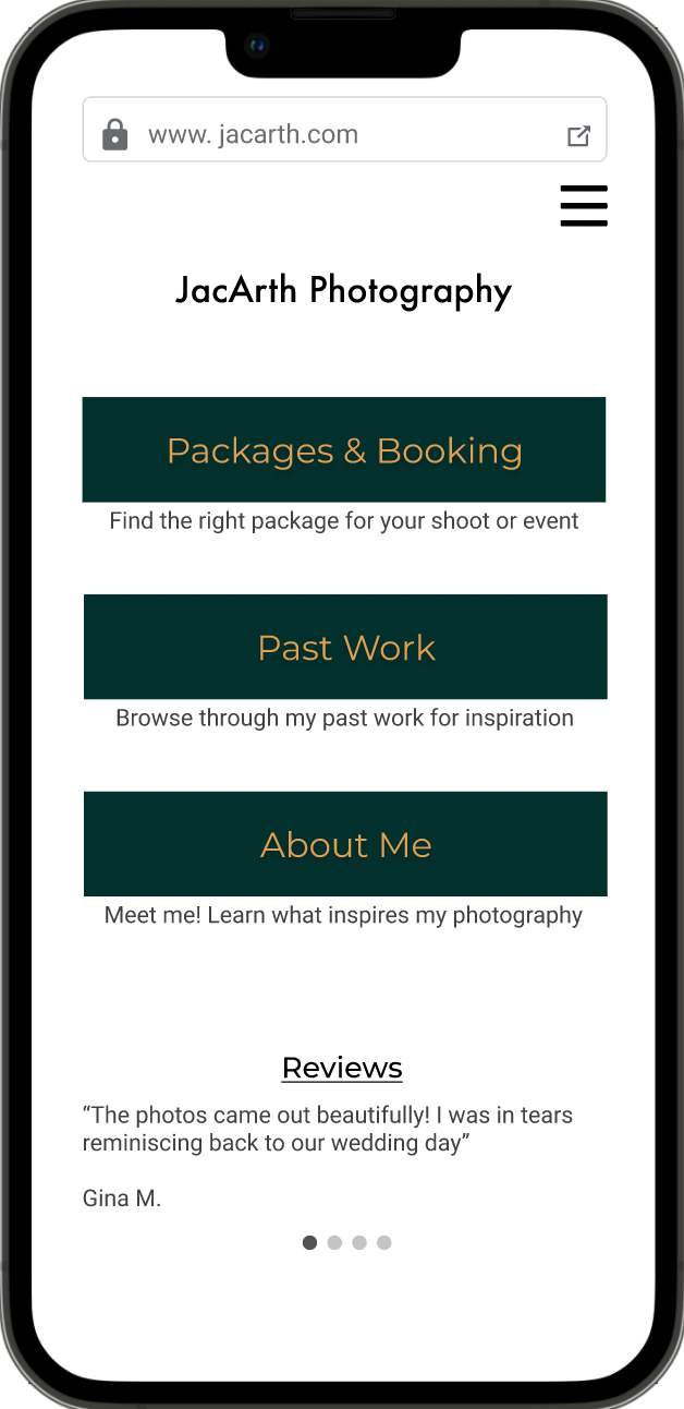
My updated user flow now included a new landing page with a menu option. The user would decide whether to go first to Packages, look at JacArth’s past work, or read about him and connect with him on the About page.
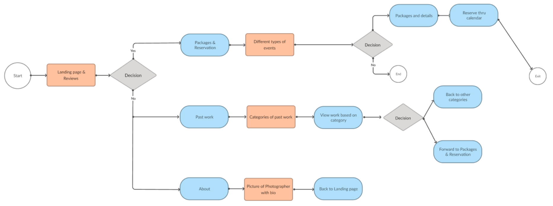
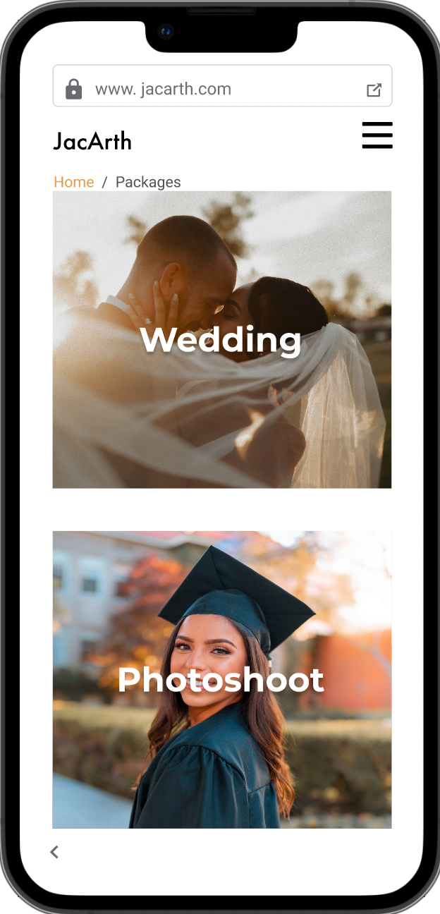
I updated the wireframes with a new landing page this time with menu options for Packages, Past Work, and About. I also added a detailed “About Me” page for the client which included his social media so he could connect with his client as mentioned in the user stories.
Style Development
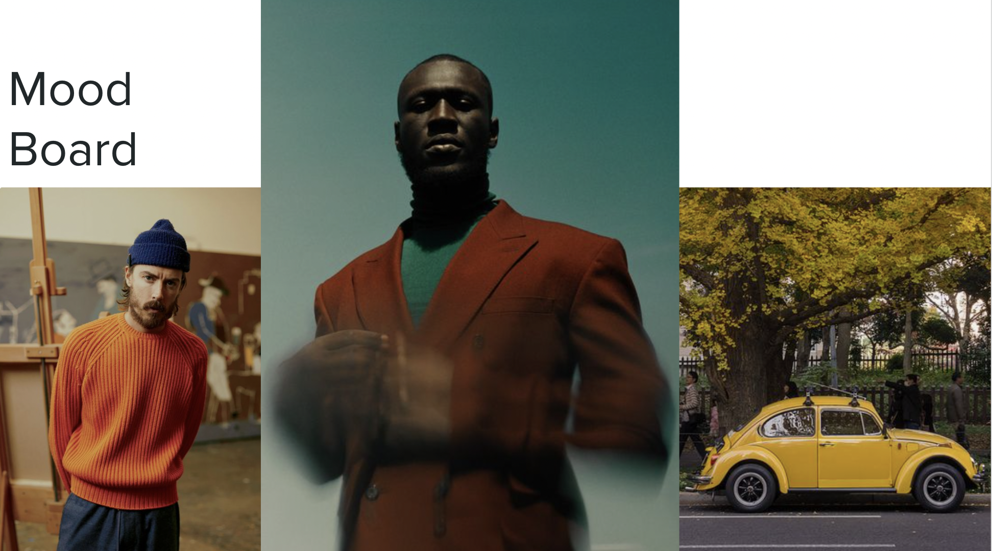
The client informed me that he wanted a classic, professional style for his website. He wanted the site to look clean and simple with notes of his favorite colors: yellows, greens, and oranges. With this information, I created a mood board which the client loved!
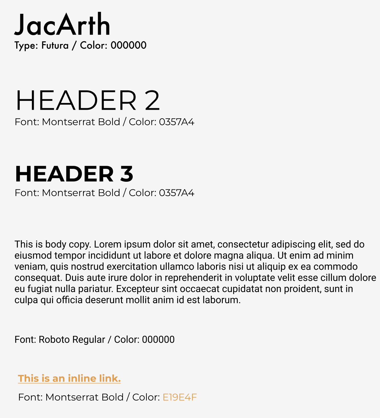
Logo and Typeface
For type faces and the client logo, the client wanted to keep these simple as well. He opted for a text logo of his business name rather than an icon. I worked with his to select a type which felt classic and clean. Customers had also mentioned that previous experiences with photographers felt out-dated so we focused on creating a modern look and feel with Montserrat and Futura type faces.
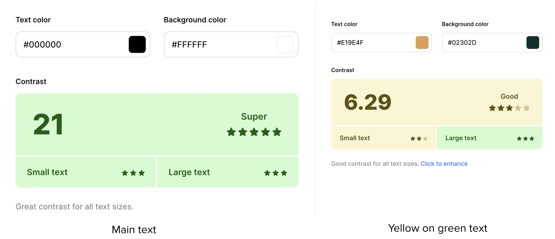
Accessibility
Accessibility was a central and crucial focus in this project. In order to ensure that the design is accessible, I passed the pages through a color contrast checker. The results are below. The main text on screen (black on white) received a high score of 21 while the accent color text (yellow on dark green) received a lower score albeit, still passed.
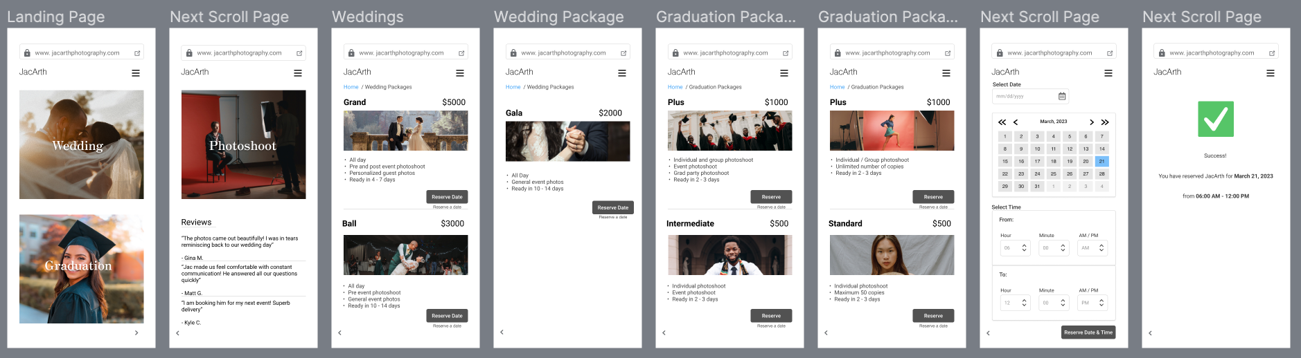
The final iteration incorporates insights from usability testing as well as style choices and logo suggested by the client.
Final Iteration and Prototype
Improvements
A new and redesigned homepage makes the layout a menu with varying user flows.
Reviews are now on the homepage on a carousel to improve navigation

Conclusion and Next Steps
The next step after the final MVP is to iterate and focus on three key areas:
Iterate on colors to improve accessibility
Add a payment screen for customers to pay on the site
Responsive designing for desktop
Successes:
The main success for this project was having been able to create a professional website which represents the client’s personal brand and delights customers.
Lessons learned:
This project taught me how to balance a client’s request with my own expert offering as a designer. I was able to strike that balance and create a successful design.
Learning Opportunities:
There is more to be learned around thinking about accessibility early in the design process. For my next project, I will ensure that accessibility is top of mind.