ArtSpace App

Problem
Decorating a space can be a stressful task. Even more so when there is a lack of reliable DIY guidance and one place to find all the pieces needed. Being an artist myself, this project is an opportunity to tackle a problem in the art/interior design market that I am passionate about.
My Role and Responsibilities
As the sole stakeholder on this project, I was responsible for all aspects of the project including: ideation, discovery, research, design, testing, and prototyping.
Audience
The primary audience for this app are arts patrons such interior designers and enthusiasts.
Solution
ArtSpace is an app that helps users find decorative pieces such as artwork they will enjoy for their space.
Discovery & Research
Research methods and data collected
The primary research methods I used were Surveying and Interviewing. The survey focused on measuring respondents comfort with interior design. The interviews then dived deeper into their experience setting up a new space.
Survey Results
The 12 survey respondents heavily emphasized their frustrations about their current interior design process. With the broad questions came many ideas to include in a solution. The ideas and suggestions broadened the project scope in the early stages. Insights from the survey included:
Broad responses with early stage suggestions
Strong need for a one-stop-shop solution
Differing needs and ideas led to wide scope
Interview Results
I Interviewed 3 users with varying interests in interior design. Insights from the interviews included:
Strong need for guidance in choosing art pieces
Need to know that pieces ordered online would fit their space
Need a place to sell pieces so they can make room for new ones
Currently rely on social media and other sites to find pieces
User Stories
From the surveys and interviews conducted, i created four user stories. For the purposes of an MVP, I prioritized the first three user stories. The forth and other potential user stories will be added in a future iteration.
As someone who just moved into a new apartment, I need help finding affordable artwork.
As someone who does not consider myself creative I need help picking artwork I will enjoy.
As someone looking to move soon, I need to know that the pieces I buy would fit the measurements in my new space.
As someone who loves decorating, I need to sell my old pieces and make room for new ones.
Personas
From the Research and Discovery, two distinct personas became apparent. One was confident in their ability to select decor. The other was not and needed guidance.
Meet Jess W.

“I love decorating! I like to change the theme of my apartment with the seasons. Easily finding interesting decorative pieces would make the process even more enjoyable”
Demographics
22 - 29 year old
Female
Creative Director
Behaviors
Outgoing and has a lot of friends
Creative and confident
Carefree and expressive
Needs & Goals
Goal to make her apartment an inviting space for friends
Needs interesting art for conversation starters
Needs to to find pieces that fit her small apartment size
Meet Kenny B.

“ I consider myself more analytical than creative. I only need the essential things to live a good life but I also like to have interesting things to make my space look alive”
Demographics
25 - 33 year old
Male
Data Analyst
Behaviors
Makes videos for YouTube
Minimal and organized
Likes to have friends over occasionally
Needs & Goals
Needs to set up a catchy space to film videos
Goal is to grow his YouTube channel
Design & Delivery
Constraints and Pivoting
The biggest constraints for this project were time and expertise. I had a short window of time to go from ideation to execution before presenting to my mentors. The time constraint helped me to focus on what really mattered which was to help users find products. With regards to my knowledge of interior design, the constraint helped me narrow down focus for the MVP; I pivoted the idea to solving challenges around accessing artwork specifically.
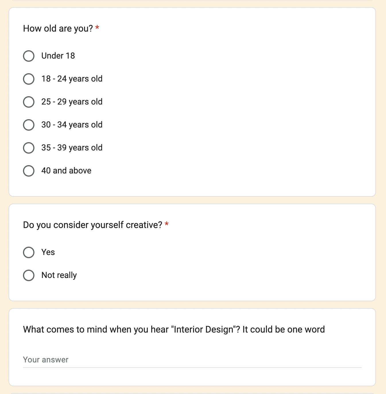
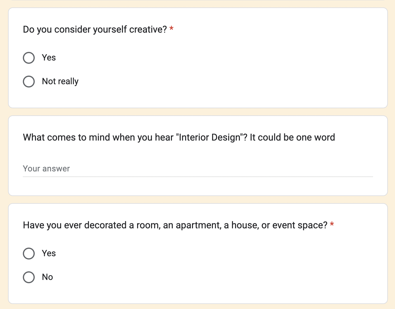
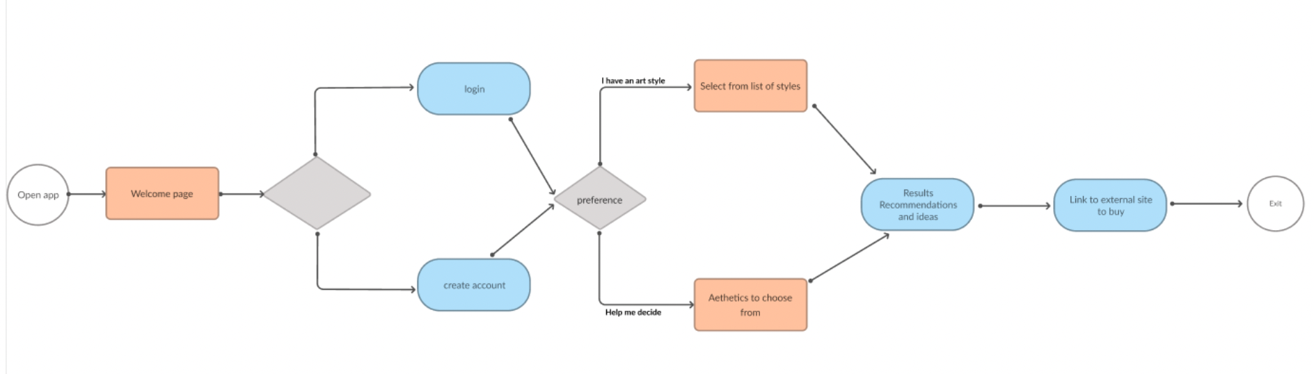
Initial User Flow
The first user flow focused on guiding users to a results page where they would eventually select items and then be linked to an external check out page. This flow would change after user testing where users felt it would be a more seamless experience to complete the checkout process on the app.
Wireframes
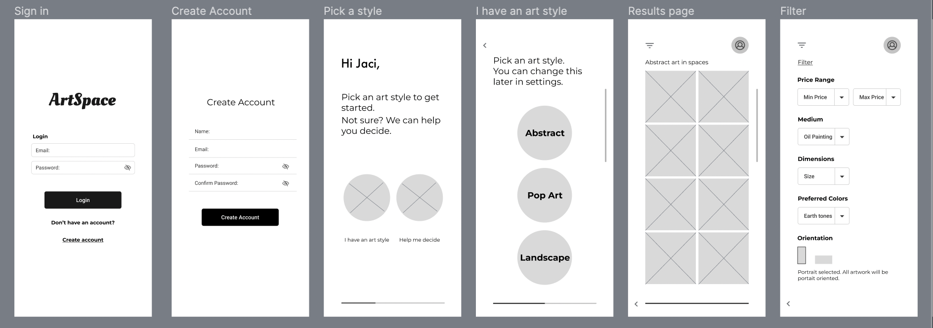
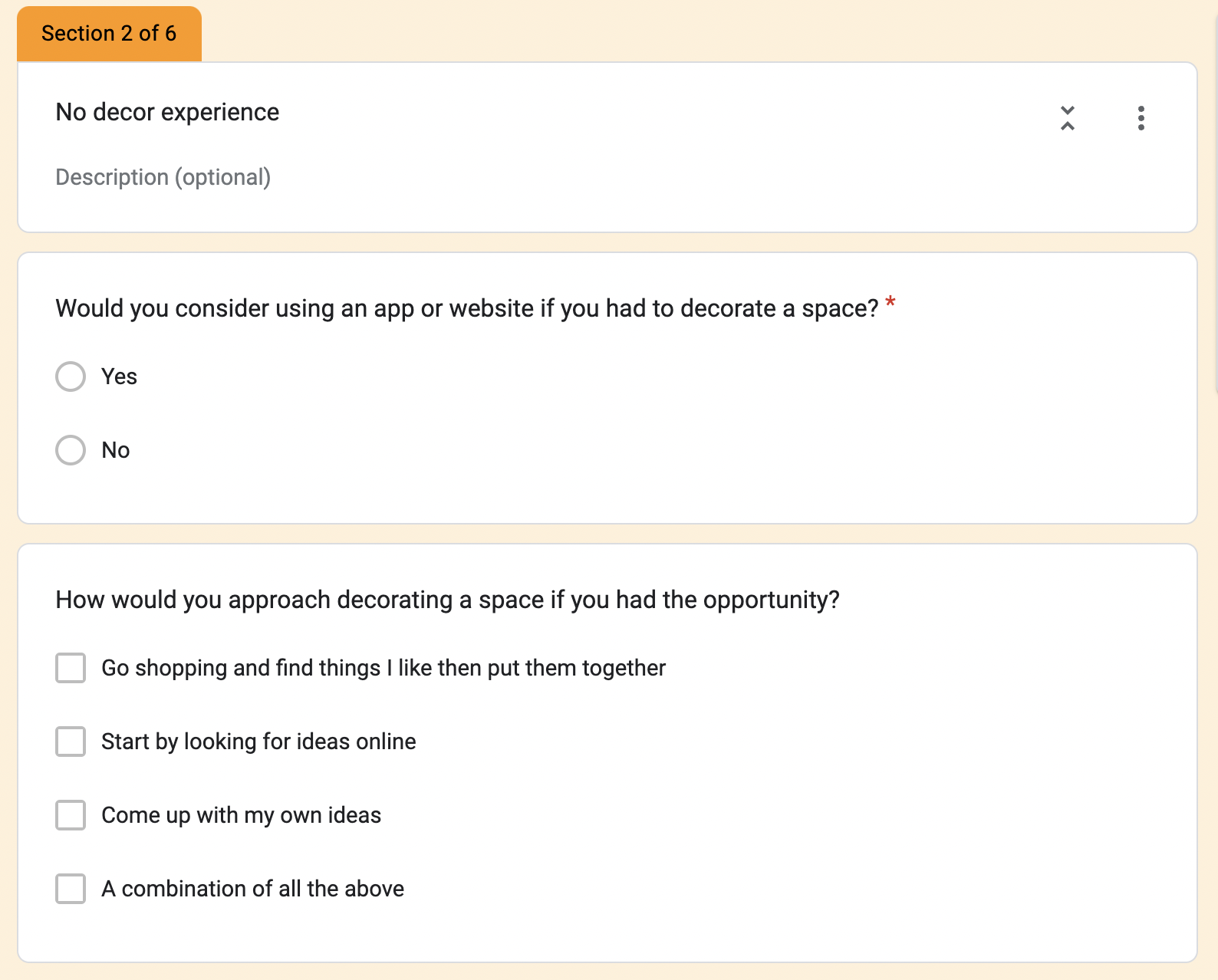
First Iteration / Initial Prototype
The first few screens featured a questionnaire leading to a result page. Notable among the screens is a ‘Filter’ that allows users to set a price range, dimensions, colors, etc.
Usability Testing
I conducted usability testing with four users on the first iteration. Users provided feedback on the existing pages as well as provided suggestions on additional screens that could be helpful. Usability testing insights were:
Landing page layout suggested multiple selection options. Users want to be able to see one result at a time
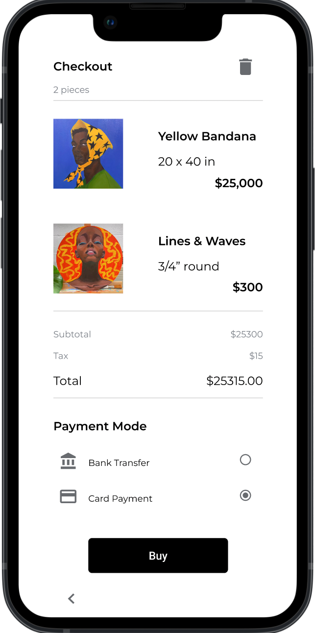
Users felt the design was missing a checkout option
Here are some statements I heard from users:
“I like how easy it is to navigate, I would prefer to see one result at a time so I can take it all in” - Jac, user
“I feel like checking out should be one of the central features for the problem this is trying to solve” - Mavis, user
Revised User Flow
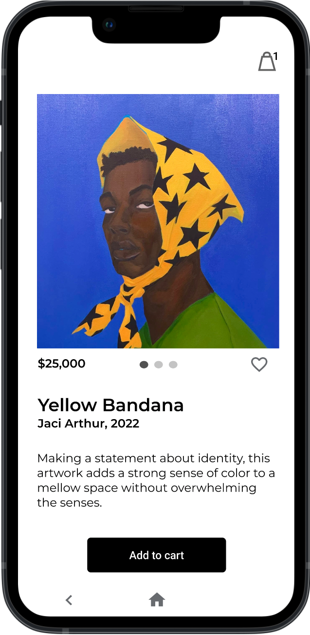
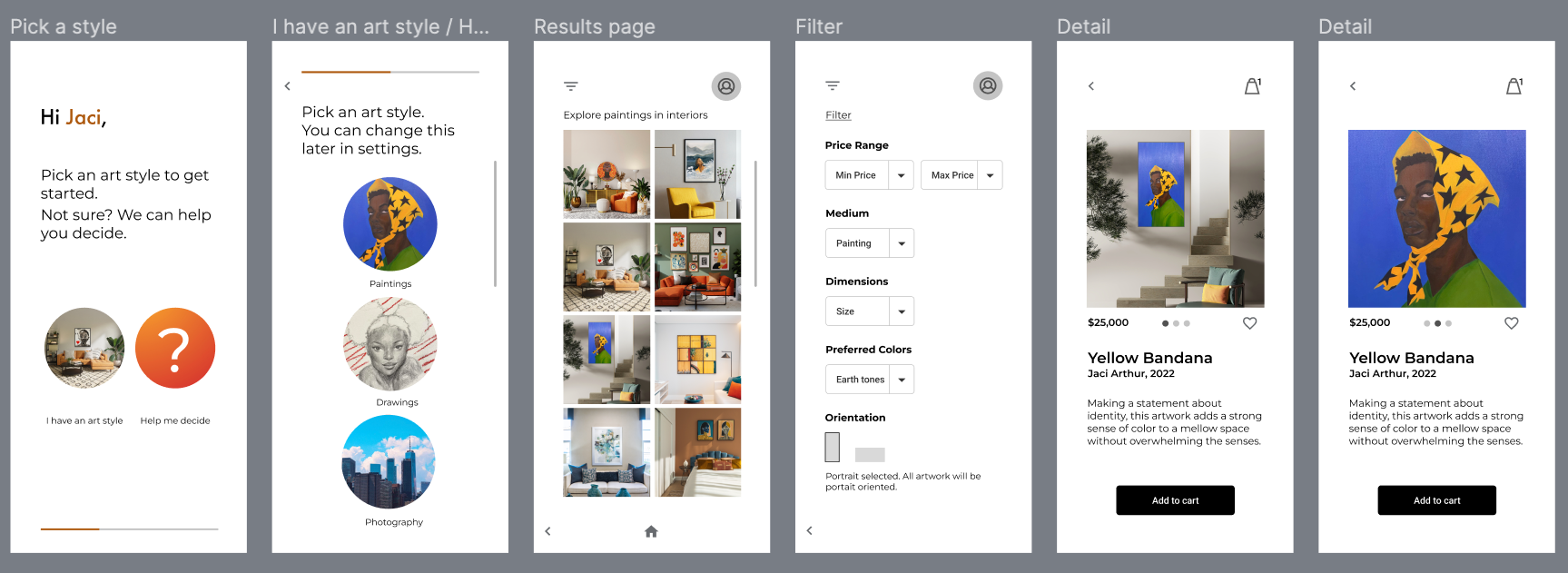
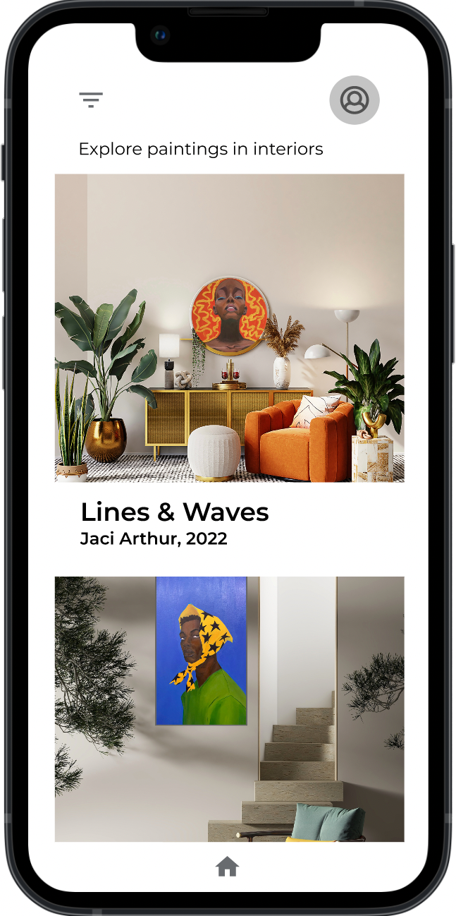
The updated user flow features a new layout for the homepage and a checkout screen. The new homepage allows users to view each result one at a time in a scoll.
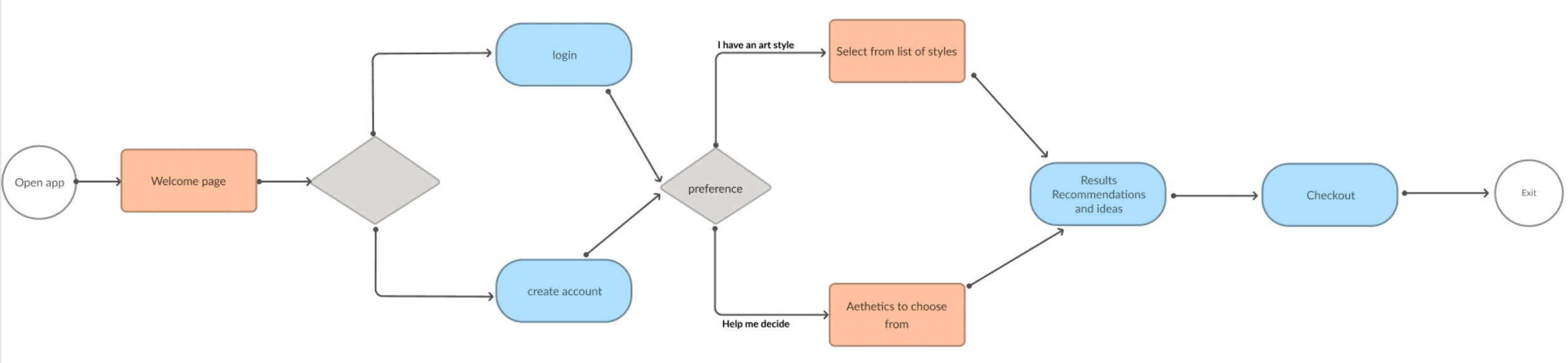
The Home page now features each artsy interior one at a time, making it easier to view. The added Checkout screen brings the design to an end which helps users understand the process better.
Revised Home Page and Checkout screen
Style Development
Competitive Analysis
I took inspiration from Instagram and Pinterest. Each provide a kind of solution for this project’s problem statement however the opportunity for this project lies is in providing a guide to the final product.
A similar solution to the problem statement is a website named PlatformArt. This site sells art with an interior design focus. I conducted a SWOT analysis as follows:
Strength: Solely focuses on art
Weakness: UX/UI not as delightful
Opportunity: Create a more delightful experience with more art options
Threat: Potentially big market share
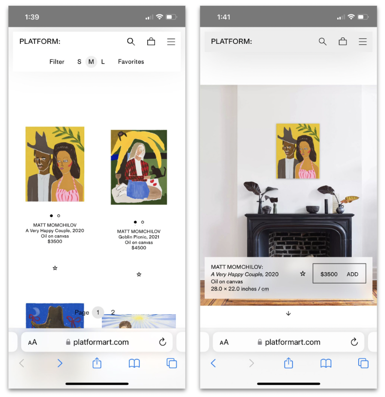
PlatformArt webpage
Typeface and Logo
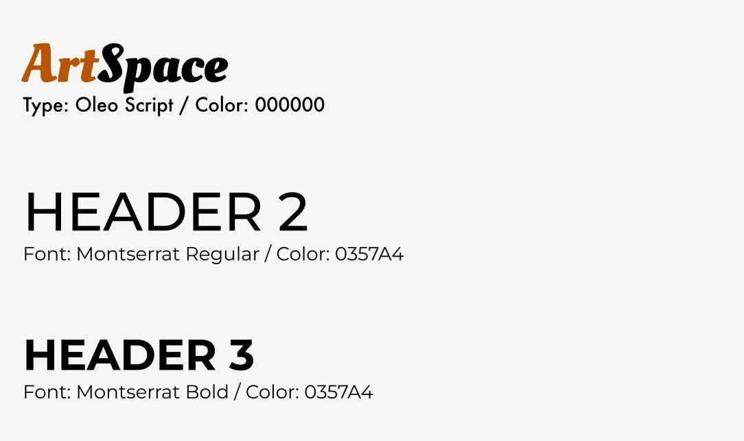
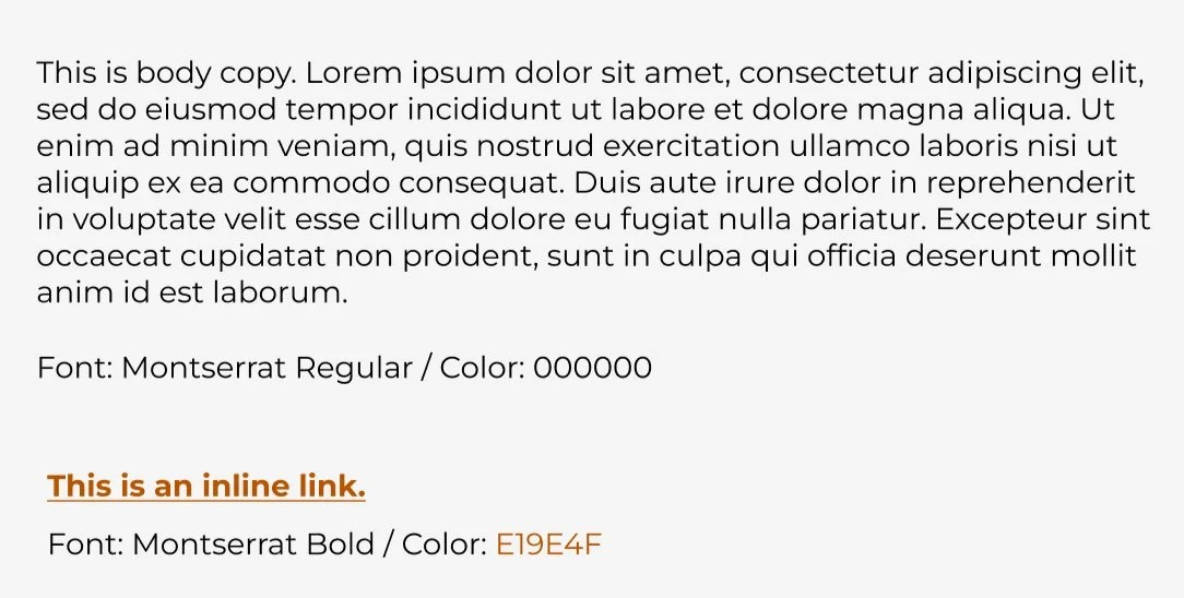
The main goal for my typefaces, colors, and logo was to avoid clashing with the artwork on the site. The style components also aimed at a clean, modern, and simplistic look and feel. For the main text and header I chose Montserrat and for the logo type, Oleo Script. These typefaces convey the clean and minimalistic feeling while conveying modernism.
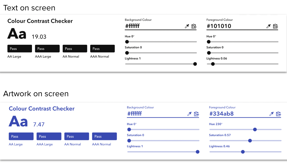
Accessibility
Accessibility is a central and crucial focus in this project. In order to ensure that the design is accessible, I passed the pages through a color contrast checker. The results are below. The main text on screen (black on white) received a solid pass. I also tested one of the artworks with the background and that did not receive the required passing score. The accessibility results for the artworks were always a concern. With the varying and subjective nature of colors, accessibility on a contrast front was always difficult to maneuver. An option in the next iteration would be to add Alt Text which would describe the artwork to users in order to improve accessibility.
Conclusion and Next Steps
Working on this project has been a delight! With the resolving app, the persona’s Jess and Kenny would have an easier and more seamless time setting up their spaces with the right artwork for them. Following a successful MVP, the next steps are to keep refining on the design and thought process. Three main focus areas are to:
Refine the checkout process
Continue to create a more seamless and delightful user flow
Add user flow for artists to create accounts and upload their work for sale
Successes
A major success with this project was that I was able to arrive at a responsive design that tackles a core part of the problem statement which was to help people choose artwork for their spaces.
Lessons Learned
Some key lessons learned is the importance of user feedback to the development of an idea. On the converse, experiencing scope creep and successfully narrowing down the scope taught me a lesson on focusing on the most important and feasible ideas first.
Learning Opportunities
One thing I could do better is always keeping my focus on the persona and users throughout the project.