Voyage Bus App
Problem
Due to expansion of bus routes, passengers had trouble finding their bus at Washington and State bus stop. They had no way of knowing what bus was arriving and when. Passengers also needed to know how much time they had before their bus arrived.
Roles and responsibilities
As the sole stakeholder on this project, I was responsible for all aspects of the project including: ideation, discovery, research, design, testing, and prototyping.
Audience
The primary audience for this app are passengers of Washington and State bus stop as well users in my immediate environment whom I tested with.
Solution
Voyage is an app that tells you when your bus is arriving and how much time you have until it arrives.
Discovery & Research
Research methods and data collected through surveys and interviews
The primary research methods I used were Surveying and Interviewing. I drafted a comprehensive questionnaire which covered how many times respondents took a bus or train, their destination, how time sensitive their travels are etc. I also used the surveys and interviews as a means to understand how they use similar apps, the features they loved and what they would like to change in the apps.
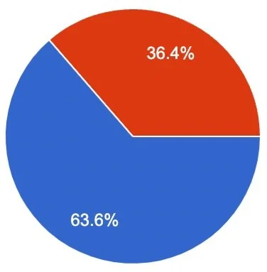
I surveyed and interviewed a group of new college grads who just moved to a big city. Majority of the respondents rely on train services more than bus services. For the purpose of this project, train and bus are used interchangeably. Survey results were as follows:
64% take public transport 4 or more days in a week
Majority of respondents travel less than an hour per trip
More than half of respondents have time-sensitive schedules
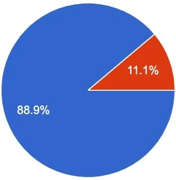
Almost all respondents keep track of their bus/trains with an app or website
Almost all respondents mentioned a need to save their favorite routes
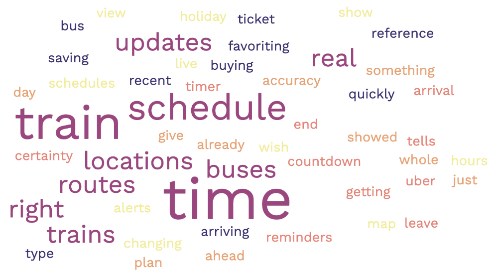
After surveys and interviews, I passed responses and transcripts through a buzz-word generator. “Schedule”, “Real”, “Time”, and “Location” were some of the frequent words respondents used.
User Stories
From the research and discovery stage, I arrived at three user stories:
As a bus rider, I want to know when my bus is arriving so I can calculate how much time I have to reach the bus stop.
As a bus rider, I want to know the next bus arriving so that I don’t rush to the bus stop if it is not my bus.
As a bus rider, I want the ability to view future arrival times for any of the seven bus lines so that I know when my bus arrives.
Competitive Analysis
I conducted competitive analyses on Transit App and Google Maps. Both apps track bus and trains and also tell users what time their buses are arriving.
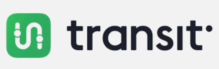
Transit is an app for buses and trains primarily for travelers and commuters. The key differentiator is color codes to show relevant bus lines for riders. It also has accurate real time for riders to be able to tell how much time till their bus/train arrives.
Strengths
Intuitive UX/UI
Simple Design
Relatively Large market share
Weaknesses
Premium feature offering: users may need to pay for more features that could be beneficial
Confusing color codes
Only serves cities and metropolitan areas
Opportunities
Covers more areas than just cities
Simplified bus categorization
Threats
Other services like Google maps have a larger market share
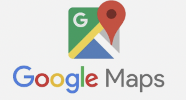
Google Maps is a web mapping platform and consumer application offered by Google. It offers satellite imagery, aerial photography, street maps, 360° interactive panoramic views of streets, real-time traffic conditions, and route planning for traveling by foot, car, bike, air and public transportation. (Wikipedia).
Strengths
Familiar and well-known
Large product offering
Large market share
Weaknesses
Wide focus and not solely fine-tuned to tracking bus times
Opportunities
Worldwide coverage
Large user base
Threats
Newer services could narrow down on one offering and do it better
Persona
Meet Mike H.
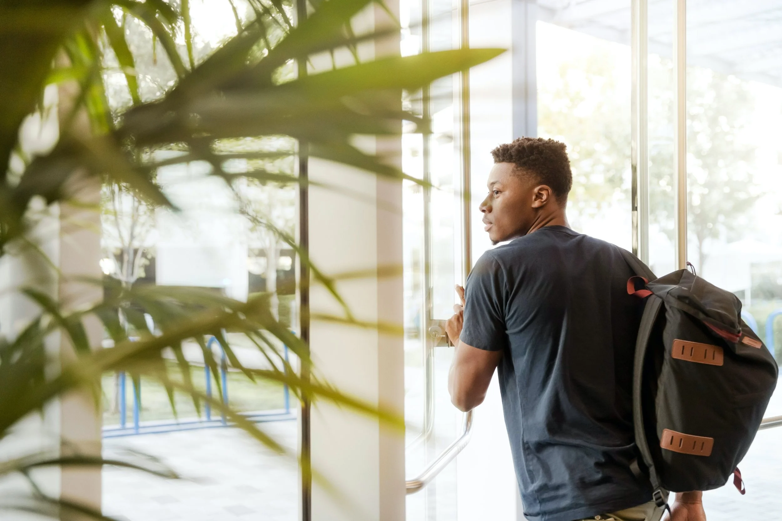
“I just started at a new job in a new city. I want to explore the city and hang out with my colleagues who are also new here”
Bio
Mike is a young professional at a FinTech company in a big city. He has an active lifestyle and enjoys exploring the city with new friends. Outside of work, Mike has a big presence on social media where he loves to share his impression on new technologies and software with his friends.
Demographic
22 - 26 year old
FinTech analyst (new job)
Recently moved to the city
Behaviors
Tech-savvy
Active lifestyle
Loves to meet friends on the weekends
Needs & Goals
Goal to excel at his new job
Needs reliable transportation
Needs his tech to keep up with him
Design & Delivery
Constraints
As the first design project I have worked on, the constraints mainly centered around my skill level; prominently, I had limited Figma design skills.
Another challenge was connecting the problem to the real life users I was interacting with. The design prompt had been for a fictitious bus stop and so I needed to be flexible in my decisions so as to make the process and solution as realistic as possible.
Style Choices
Initial style and theme choice was a purple mood with roboto. Without extensive research, I had wanted the product to inspire a sense of luxury. After conducting extensive research on color choices, I decided to revise the theme.
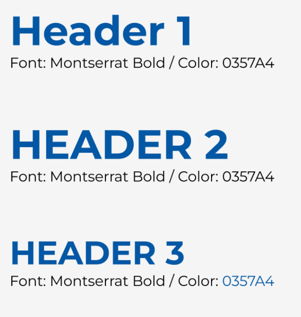
With accessibility in mind and to inspire a sense of reliability, I decided to switch to a blue theme with blocky Monteserrat type. I chose to prioritize legibility and reliability to keep up with my persona Mike and his on-the-go lifestyle.
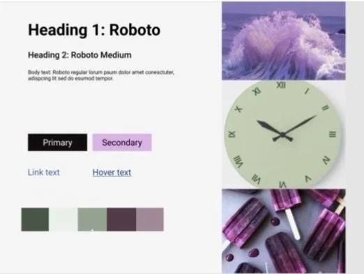
Initial mood board and style choice
Revised Mood Board and Style Choice

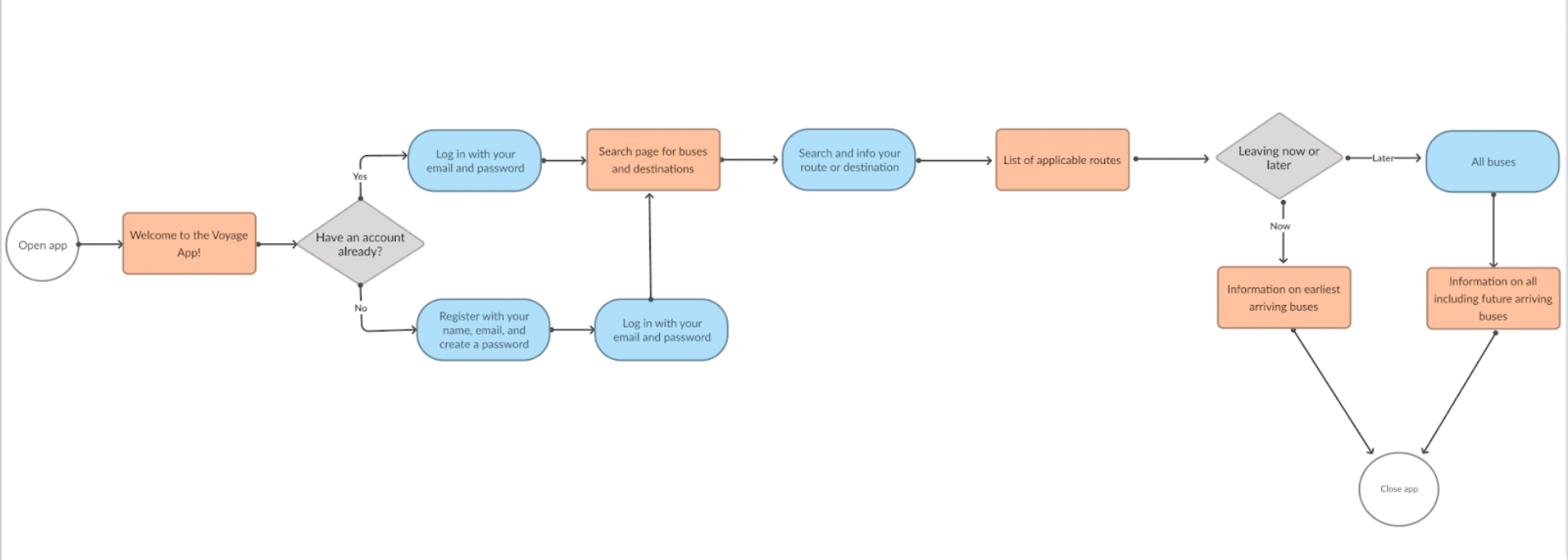
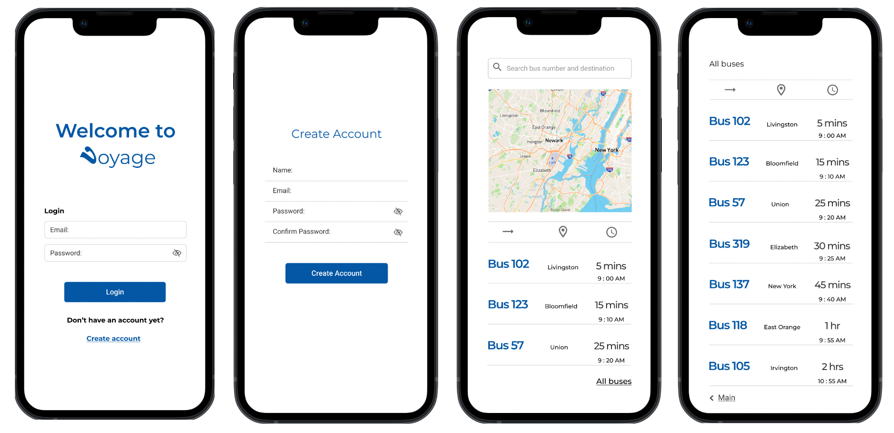
User Flow
From discovery and research, users mentioned their need to save their favorite routes and have a personalized experience. With this information in mind, I added an account creation and registration process so as to capture user information.
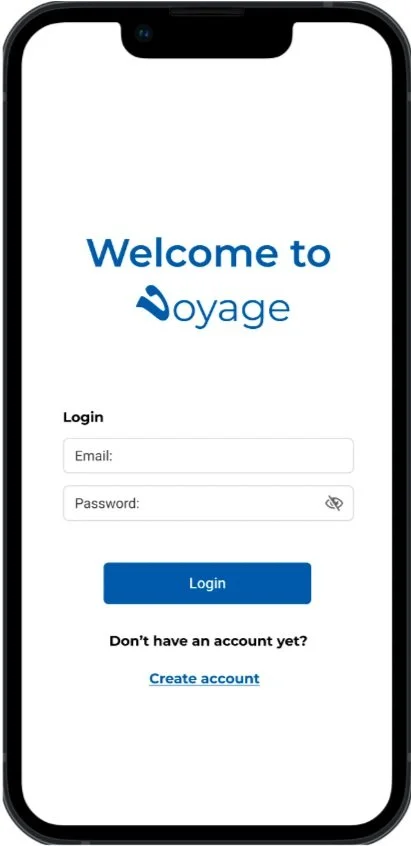
The user flow would begin from their device’s home screen to a welcome page.
On the Welcome Page the user would have the option to log in or create an account.
On the login screen they would enter an email and password. On the Create Account screen they would register and be taken back to the login screen.
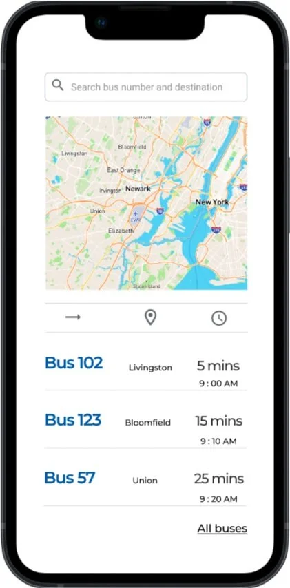
After logging in, users would then be taken to the main page with a search feature and list of all the bus numbers and times.
On future versions of the app, the user would be able to set their departure time and get information on the earliest arriving bus.
After accessing all the needed information, a user can exit the app or go back to the main page
Wireframes
Lo-fi to digital wireframes
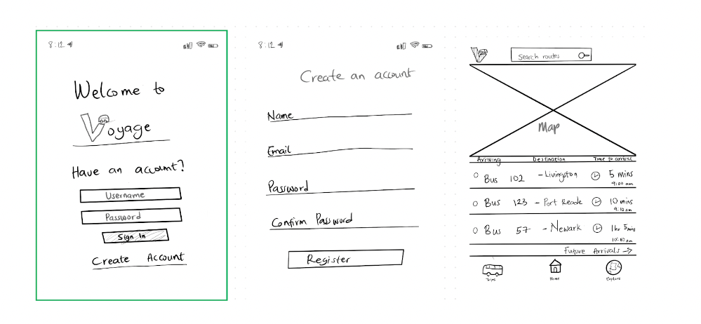
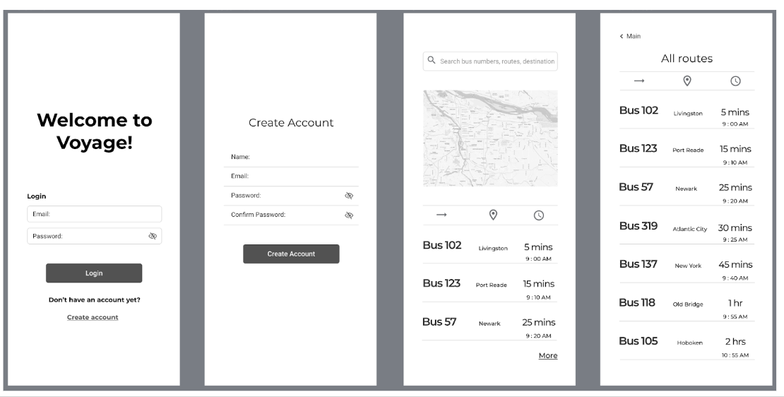
Initial Prototype
Usability Testing
I conducted usability tests with three users who provided valuable feedback on my initial prototype.
Positive feedback from usability testing included:
Easy onboarding
Smooth navigation
Simplistic design
Opportunities for improvement according to users were:
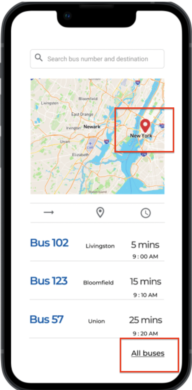
Add a location marker on map: Users felt the need to be able to see where they and the buses were located on the map was missing
More breadcrumbs larger: Users felt that the text for breadcrumbs were not legible enough
I addressed user feedback by iterating to add location markers to the prototype and increasing breadcrumb text sizes. Adding a location marker responds to points raised in discovery where users valued location as one of the most important features they needed. Additionally, making breadcrumbs more legible improves how easily and quickly Mike H. would be able to use the app on-the-go.
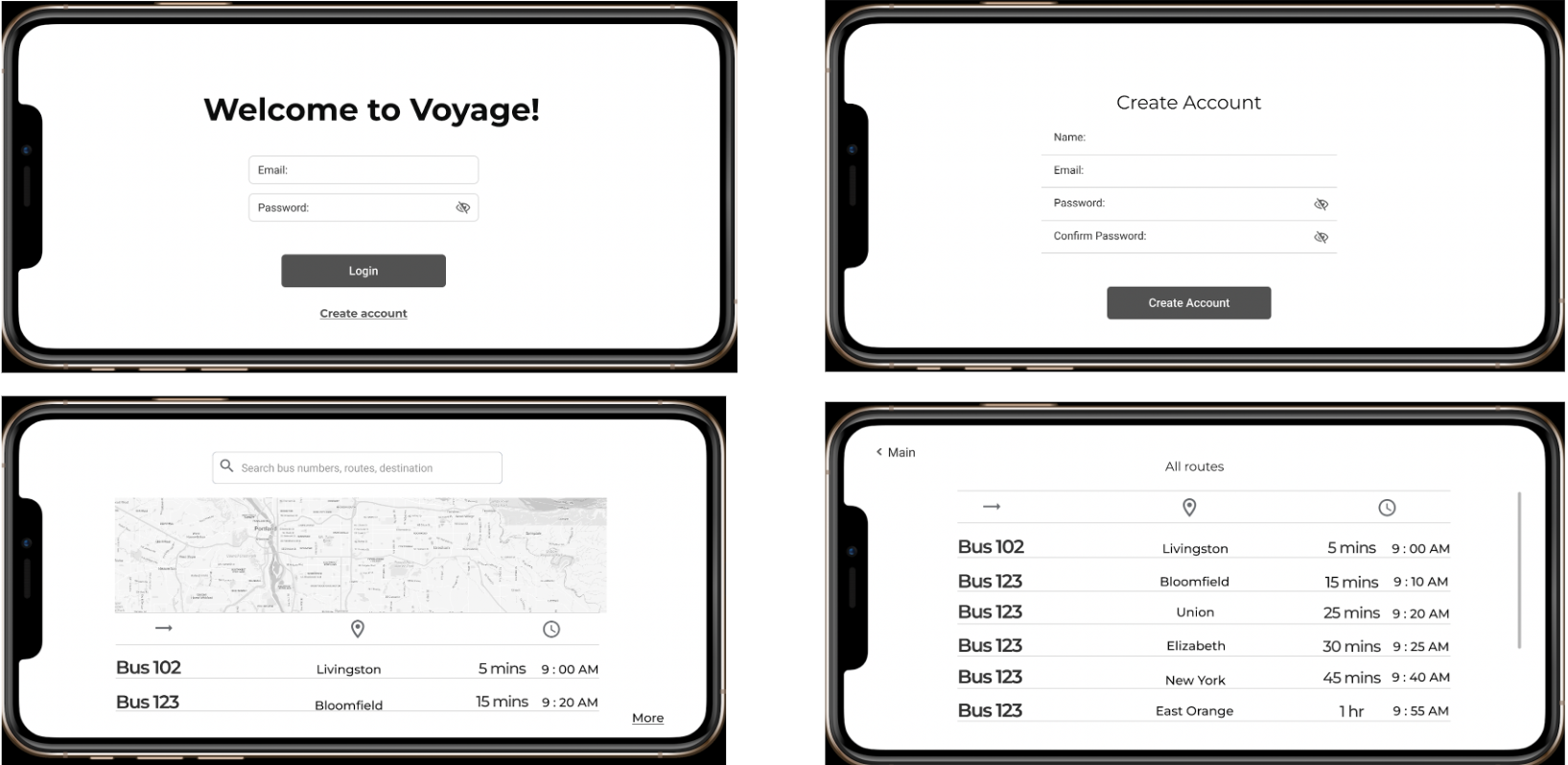
Homescreen update after usability testing
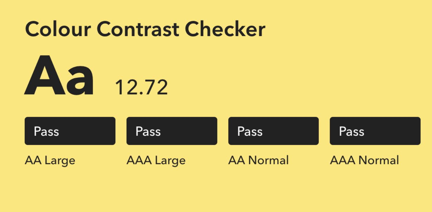
Accessibility Check
My design received a pass on all levels with a score of 12.72 for color contrast. The app’s good accessibility was also highlighted by users during testing who felt that the app was easy to navigate, the text was legible, and the images were well contrasted.
Conclusion & Final Thoughts
Successes
The goal to design an app that would help users find their bus, know how time till their bus arrived, and know which bus was arriving and when, was exceeded. I successfully reached this goal while also adding additional features like personalization to improve the user experience.
Lessons learned
I learned that users appreciate it more when designs are tailored to their needs rather than generalized or broad. My users appreciated that there was thought put into personalizing the commuting journey.
I also learned the power of color and thematic choices and what they connote to users. Due to this, I changed my initial style choice from a purple theme to a trusted blue.
Learning Opportunities
Through the process I learned the importance of paying attention to details and being meticulous in my work. It paid more dividend to carefully work on the process so as to identify pain points users had not raised.
Next Steps
The next step is to focus on responsive design by fully fleshing out the horizontal view of the app and adding a tablet view.